Websites have come a long way in the last fifteen years. In the beginning (yes there was a beginning for the commercial Internet), there were only very basic browsers with very basic capabilities. Now, however, browsers are quickly becoming the interface of choice for many web-based applications. But what does this mean for you as a tour or activity operator? Well, generally speaking, it means you are lucky it’s today and not fifteen years ago because you now have access to sophisticated tools and incredible designs at a fraction of the cost. Most of your customers also have access to high speed Internet connections which means that you don’t need to be quite so concerned with images and videos as you did even a few years ago. Here is my top ten list for things to keep in mind as you move forward with your website (re)design.
- Design for modern browsers. This means making sure your website is designed to appear consistent in Firefox, Safari, and Google Chrome.
- Consistent branding and header. Make sure your header area and branding is consistent across all your pages. This is important because your visitors will come to rely on your header for important links. Don’t forget to make sure your logo is a clickable link back to your home page. Your header will also provide important keywords for searching purposes.
- Design for mobile first. Don’t know what I mean? According to Google, the majority of people are now search for and viewing websites on their mobile devices, including smartphones and tablets. Browsing on laptops or desktops is becoming the exception rather than the norm. And certainly, when the person is in destination, they are looking at your site on a mobile device. Taking into account that this is a much higher resolution environment, also consider increasing your default font size to accommodate larger monitors.
- Keep navigation simple and consistent. Nothing irritates a visitor more than having to hunt around for information. Make sure your navigation is easy to use, located in a consistent place, and provides access to all your vital information.
- Keep important content above the fold. Make sure your page header or content of interest is visible above the fold. This means making sure that your header is not so big that it uses up all the most valuable real-estate on the screen. Remember that most users scan the site from the upper left corner to lower right corner, unless there is an image or headline that draws their attention.
- Consistent branded colors. This means using your branded colors in a conservative manner and only where required. Avoid using bold red or multicolored text, it may attract attention, but it will also drastically reduce the professionalism of your site.
- Use images that are relevant, meaningful, and professional. Make sure that any images you use, whether they are icons, photos, or screen grabs are high quality and properly sized. Keep your images at web resolution and not just resized to fit on the site. A large photo that is reduced to fit without adjusting the resolution will result in a pixelated image that looks unprofessional.
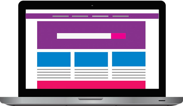
- Balance text, images, and white space. You’re probably not a designer and that’s okay. Chances are that you’ve been around the web and visited sites that you like and sites that you don’t like. Make a note of how the sites that you like are designed and emulate them. You’ll probably find that most of the sites you like share common elements.
- Stick with a white background. Lots of sites have different colored backgrounds but in my opinion, nothing is more versatile then the white background. This is especially true if you plan on integrating other services or applications into your website.
- Use Flash or other animated objects sparingly. Don’t use Flash animation just because you can. Unless you have a meaningful message to convey with an animation, I recommend you stick with text and a nice professional photo instead. If you do use Flash, give your visitor the ability to skip it easily or turn it off altogether.
Bonus: For the love of all things good and user friendly, please do not auto-play music on your website. Nothing is more of a turn off on a website than listening to a midi version of “Stairway to Heaven”. Just because you can play background music, doesn’t mean you should.
You should now be confident in your ability to move forward with a (re)design of your tour and activity website. Take what you have learned here and apply it to your next steps of either designing the site yourself or hiring a web designer to do it for you.
References:
- http://developer.apple.com/internet/webcontent/bestwebdev.html
- http://www.businesslink.gov.uk/bdotg/action/layer?topicId=1075384855
- http://www.smashingmagazine.com/2008/12/15/10-useful-techniques-to-improve-your-user-interface-designs/
- http://psd.tutsplus.com/designing-tutorials/9-essential-principles-for-good-web-design/
- http://www.smashingmagazine.com/2009/06/29/45-incredibly-useful-web-design-checklists-and-questionnaires/


